There were 3 main iterations of the logo design for Branripple. All designs incorporated a bag in some way to push the message of the brand to the consumer. Initially the company had planned to go with a striking orange colour palette for the brand, however changed to a pastel pink later on.
My personal favourite is the second design listed below - however the brand leaned more towards the third logo design. From a design perspective I feel that the second logo is much more defined and pleasant to look at, but I understand why the brand chose the third one based on simplicity alone.


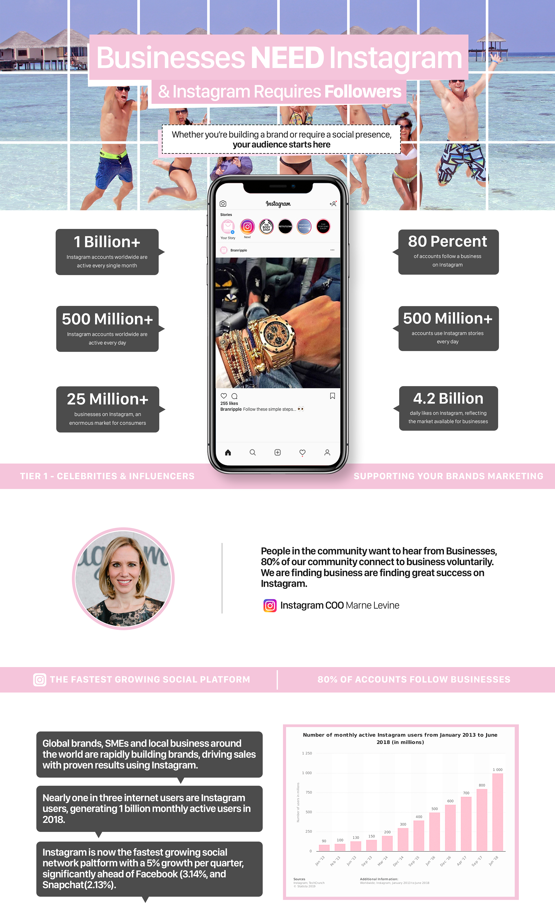
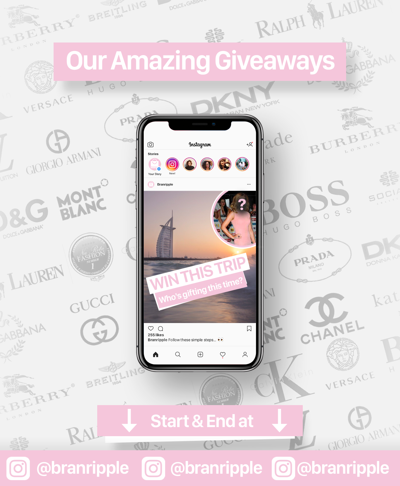
For the website design and images, I was given the direction pointer of a 'handmade' feel to resonate with the consumers. Minimalism was a huge focus - taking a lot of inspiration from Apple and Pretty Little Thing. The majority of the titles were shadowed by an asymmetrical border, or a dashed stroke to try and sell the 'cut and paste' effect.


